
Monday, 11 April 2016


MAGAZINE INSTITUTIONS
What is an institution?
An establishment in charge of distributing, marketing and producing different media products:
- Time Inc.
- Bauer Media Group
- Emap
- Development Hell Ltd
Time Inc.-

Time Inc. UK is Britain’s leading publisher of print and digital magazine content. With more than 60 iconic brands - including Decanter, Country Life, Horse & Hound, NME, What's On TV and Wallpaper* - Time Inc. UK (formerly IPC Media) creates content for multiple platforms, across print, online, mobile, tablets and experiences.
Bauer-

Bauer Media is a division of the Bauer Media Group, Europe’s largest privately owned publishing Group. The Group is a worldwide media empire offering over 300 magazines in 15 countries, as well as online, TV and radio stations.
These two institutions are both linked to the distribution, marketing, and producing of NME, one of the largest British music journalism magazine, and it is largely associated with rock, alternative and indie music. It was the first British paper to include a singles chart, in the edition of 14 November 1952. In the 1970s it became the best-selling British music newspaper. During the period 1972 to 1976, it was particularly associated with gonzo journalism (self-involved reporting), then became closely associated with punk rock through the writings of Julie Burchill, Paul Morley and Tony Parsons. It started as a music newspaper, and gradually moved toward a magazine format during the 1980s and 1990s, changing from newsprint in 1998. However the main company that owns and helped NME become one of biggest magazines and had further audiences to reach is Time Inc., which would mean more publicity for my magazine and a higher chance of it becoming successful and a popular magazine, producing more income overall.
Sunday, 3 April 2016

Thursday, 24 March 2016
CONTENTS PAGE ANALYSIS
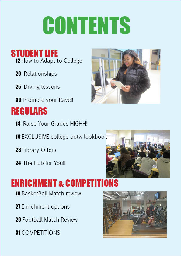
The layout structure is very simple and sub-par because there is only one column, there's three separate pictures set in a haphazard way, and lacks vibrancy due to the excess of empty space on the page. The column also overlaps to the left and centre third, which doesn't look visually dynamic with the photos. However the page numbers are organised into different categories still in the correct order so it's easier to understand where things are. There is no colour scheme and the fonts aren't very engaging to the eye, due to how thin and boring the type is. The colours clash in a way that makes me uncomfortable and not want to look at the page for long. The actual article titles aren't organised in a way that makes sense within the categories.

The style and layout of the page is very professional and clearly set out, but it doesn't have any photos and only has a cartoon image of a leaf which bares no relevance to the actual context of the page. The lack of photos makes it less inviting and not as friendly. The layout structure also doesn't include a left, centre, or right third, making the page as a whole uninteresting. There is only one font for everything and the font it uses is quite clinical and might remind the reader of a hospital pamphlet. The colour scheme is of grey, white, black, blue and a darker blue, which, again, is quite cold and similar to that of a hospital pamphlet and the colours probably wouldn't be attention grabbing for the target audience.

This contents page uses the same font for both the title, the page titles, and articles, which isn't very exciting to look. on the other hand the image used as the background has the model holding a psychology texbook, which is in mis-en-scene with the genre of the magazine as a whole. The font colours of black, yellow and red (for page numbers) all fit to a scheme except yellow, which is random and confusing, however the page number match with the model's clothing. The article names aren't bold enough so you can't read them without having to concentrate, especially when the text is over the model. The writing in some parts even goes to the next line without even finished the word and there are also spelling mistakes. There is a lot of space around each chunk of text and the title which makes the text seem more clustered and messy.
Subscribe to:
Posts (Atom)