Friday, 22 April 2016

PUBLICATION PLAN

Publication plan for my music magazine

Name:


Positioning statement: the UK's greatest music magazine

Frequency of publication: monthly

Price: £3.99

Distribution: Bauer Media Group -

  • Newsagents 
  • Retail stores/supermarkets
  • Venues/gigs/concerts
  • Music shops
Rationale: News/gossip on indie rock, or similar, bands and artist, as well as exclusive interviews, posters and stunning photography of gigs and the knowledge of release dates.

Style: My magazine will have a strong and mildly formal structure to it, in a way that the general public and, more in particular, the younger generation will be able to follow and get quite caught up in. I also wanted to include material that they would find relatable, so they can feel connected to the actual bands and music itself.

Regular content: 

  1. Interview with a new, up-and-coming band.
  2. Closest dates of small intimate gigs.
  3. Most shocking news of the month.
  4. Article of biggest name in the genre that month.
  5. Album of the month
  6. Band rivalry
  7. Competition to win tickets, merchandise, or meeting.
  8. Golden oldie/ flash from the past - vintage music reference page.


Feature content:

  1. Knowledge of the acts on at Leeds fest.
  2. Music fashion article.
  3. Secrets about hidden track by Wolf Alice.
  4. Exclusive interview with Catfish and the Bottlemen.
  5. A guitarist's personal experience with depression.
  6. Free poster of Cage The Elephant.
  7. Fans review of favourite artist of the year
  8. Exposure of opinions on sub-genres.

EVALUATION

FONT DESIGN


FRONT COVER ANALYSIS


The main image is in black and white, and has the model (Liam Gallagher) looking into the distance. Using the black and white filter makes the artist seem dark and brooding. The shot is also quite powerful because the first you see is him, and he stands out more than writing. The glasses block out the eyes and therefore you can't tell what he's looking at, which connotes mystery and hints that he's concealing his identity. This also doesn't use direct address probably because the artist is egocentric and is above it.
 
The masthead is what tells the reader which magazine it is that they're picking up, therefore has to standout against other competitors on the shelf. NME has a set brand masthead which continues through every release of the magazine.

The fonts are red, black and white. Red is the house style of the NME masthead and then the other text that is red is chosen either because the colours are articles that are alternating in colour.


FIRST DRAFT - FRONT COVER, CONTENTS PAGE + DPS


PHOTOSHOOT - MUSIC MAGAZINE


Wednesday, 13 April 2016

CONTENTS PAGE ANALYSIS


This Q contents page's layout is in dual columns and separate blocks, which looks neater as the information is organised into appropriate categories. The titles of the stories are in a simple, bold and capitalised font and are all tightly compacted to get more content on the page and therefore have more articles on a singular page. The images shown are on the middle and right third of the page and the first one takes up at least 75%of the page overall, suggesting the feature is the main article in the magazine. The whole band is visible and the clothes they're wearing are all blacks and greys which is quite simplistic but can give the impression of their band genre. The location is up a mountain which can show isolation but also success and rising above others. The second picture on the page is in the centre of the lower third and is of a man leaning on a column, illustrating a different section to the magazine. The page numbers are positioned on the very left, before their page article names, and are in the same font. In addition they are on the images which gives the reader a visual queue of where the article is and what it is about. The colour scheme is simplistic as the colours used are black, white and red, these colours complement each other and gives the magazine a refined look which makes it also look more professional.


Monday, 11 April 2016

DOUBLE PAGE SPREAD


RESEARCH - QUESTIONNAIRE


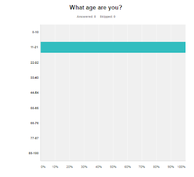
Results graphs


DOUBLE PAGE SPREAD ANALYSIS


CONTENTS PAGE


MAGAZINE INSTITUTIONS


What is an institution?
An establishment in charge of distributing, marketing and producing different media products:

  1. Time Inc.
  2. Bauer Media Group
  3. Emap
  4. Development Hell Ltd

Time Inc.-

Time Inc. UK is Britain’s leading publisher of print and digital magazine content. With more than 60 iconic brands - including Decanter, Country Life, Horse & Hound, NME, What's On TV and Wallpaper* - Time Inc. UK (formerly IPC Media) creates content for multiple platforms, across print, online, mobile, tablets and experiences.


Bauer-


Bauer Media is a division of the Bauer Media Group, Europe’s largest privately owned publishing Group. The Group is a worldwide media empire offering over 300 magazines in 15 countries, as well as online, TV and radio stations.


These two institutions are both linked to the distribution, marketing, and producing of NME, one of the largest British music journalism magazine, and it is largely associated with rock, alternative and indie music. It was the first British paper to include a singles chart, in the edition of 14 November 1952. In the 1970s it became the best-selling British music newspaper. During the period 1972 to 1976, it was particularly associated with gonzo journalism (self-involved reporting), then became closely associated with punk rock through the writings of Julie Burchill, Paul Morley and Tony Parsons. It started as a music newspaper, and gradually moved toward a magazine format during the 1980s and 1990s, changing from newsprint in 1998. However the main company that owns and helped NME become one of biggest magazines and had further audiences to reach is Time Inc., which would mean more publicity for my magazine and a higher chance of it becoming successful and a popular magazine, producing more income overall.


Thursday, 24 March 2016

CONTENTS PAGE ANALYSIS


The layout structure is very simple and sub-par because there is only one column, there's three separate pictures set in a haphazard way, and lacks vibrancy due to the excess of empty space on the page. The column also overlaps to the left and centre third, which doesn't look visually dynamic with the photos. However the page numbers are organised into different categories still in the correct order so it's easier to understand where things are. There is no colour scheme and the fonts aren't very engaging to the eye, due to how thin and boring the type is. The colours clash in a way that makes me uncomfortable and not want to look at the page for long. The actual article titles aren't organised in a way that makes sense within the categories.


The style and layout of the page is very professional and clearly set out, but it doesn't have any photos and only has a cartoon image of a leaf which bares no relevance to the actual context of the page. The lack of photos makes it less inviting and not as friendly. The layout structure also doesn't include a left, centre, or right third, making the page as a whole uninteresting. There is only one font for everything and the font it uses is quite clinical and might remind the reader of a hospital pamphlet. The colour scheme is of grey, white, black, blue and a darker blue, which, again, is quite cold and similar to that of a hospital pamphlet and the colours probably wouldn't be attention grabbing for the target audience.


This contents page uses the same font for both the title, the page titles, and articles, which isn't very exciting to look. on the other hand the image used as the background has the model holding a psychology texbook, which is in mis-en-scene with the genre of the magazine as a whole. The font colours of black, yellow and red (for page numbers) all fit to a scheme except yellow, which is random and confusing, however the page number match with the model's clothing. The article names aren't bold enough so you can't read them without having to concentrate, especially when the text is over the model. The writing in some parts even goes to the next line without even finished the word and there are also spelling mistakes. There is a lot of space around each chunk of text and the title which makes the text seem more clustered and messy.


EDITING - FRONT COVER

Before editing:


After editing:


Using Photoshop I used the clone stamp tool to take away any imperfections which disturbed the page as a whole, added in some vibrancy adjustments and colour filters. I made the wall behind the model match the colour scheme. I also darken the darker parts of the picture for more definition and to make him stand out more, similar to the genre.


Wednesday, 23 March 2016

EDITING - DPS

Before editing:


After editing:


To edit and assemble my music magazine DPS I used Photoshop, because it has the most tools that are appropriate and perfect for making a photo looks better and you can uses things like filters and saturation adjusting. I decided after experimenting with these tools to use the threshold adjustment because I thought it suited my genre as it looks quite simple but is also quite arty and makes the model/artist seems more mysterious.


BRAINSTORM


Magazine name : Polarize
Magazine genre: Indie rock

MOODBOARD


Sunday, 20 March 2016

DRAFT - FRONT COVER, CONTENTS PAGE + DPS


ANALYSIS OF COLLEGE MAGAZINES


The main image is using direct address because the model is looking directly into the camera. The title has a clear font with an eye-catching colour and size  draw the audience's attention, which would be primarily be students. The left and right third have all the puffs/pugs which has the effect of averting the readers attention towards the model in the main image. The masthead is behind the model's head, which is in convention with a professional magazine which makes it more effective. The colour scheme is linked in with the masthead, which has the dateline underneath in the right third and has the font colour as yellow, and the puffs provide the same or complimentary colours, white and blue.  It also has a bar code, with the price line and issue number connected in a block of yellow. 


The masthead looks unprofessional as it seems to have originated from a tool such as WordArt as well as it taking up the whole of the top third of the college magazine. The font of the puffs is very childish and there seems to be no existing colour scheme which makes the whole page look unorganized and chaotic. The main image, whilst using direct address, is an awkward and unedited image,which would not attract the target audience due to his more mature appearance. There is a bar code.


The masthead is behind the model's head, of whom looks underage, which makes it look professional however the thin font makes it look dull and generic. The text is covering his face, which distracts the audience and defeats the purpose of having a central image. It also has incorrect spelling. It has a bar code. The colour scheme is very loose because of the three colours used only to are repeated, one being the title font colour.